A Pirate made of yarn: visual identity and photography for Wolly Roger
Commercial brand photography and visual storytelling for small businesses in Amsterdam and across Europe

From vision to reality: the birth of Wolly Roger
In 2020 Jessica reached out to me with a dream. She wanted to launch her webshop for yarn and already carried a clear idea of her brand name, her colors, and her pirate-inspired logo. I was the one to translate that vision into a visual identity. Together we created the first Wolly Roger logo, a cheeky pirate made from a ball of yarn with crossed knitting needles. It was playful, bold, and instantly recognizable.
Fast forward a few years and Jessica is now also the proud owner of a physical store in Colmar, France. Her brand has grown from a simple online shop to a thriving community space where people can touch the yarn, feel the textures, and step into the creative world she has built. Being part of that story as a designer and later as a photographer has been incredibly rewarding.
From a logo on paper to a pirate with personality
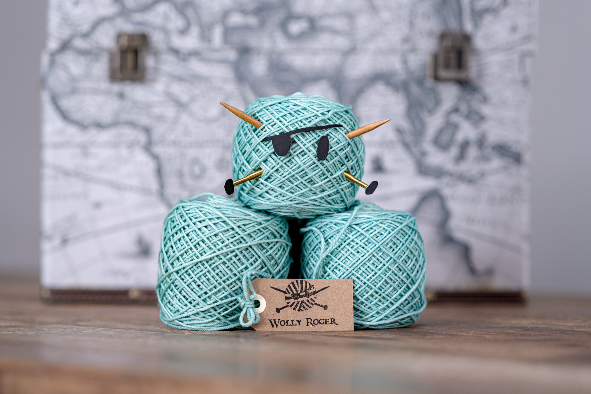
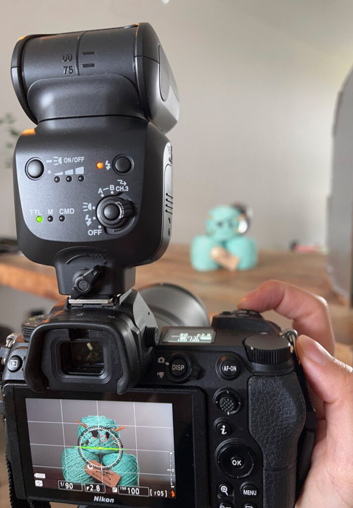
The Wolly Roger logo was always witty and bold, but I wanted to push it further. For a recent project I styled yarn and needles into a pirate face and photographed it in the studio. In front of the camera, the logo came alive.
A ball of yarn becomes a pirate with charm. A simple logo becomes a mascot that customers remember.
A visual identity that works everywhere
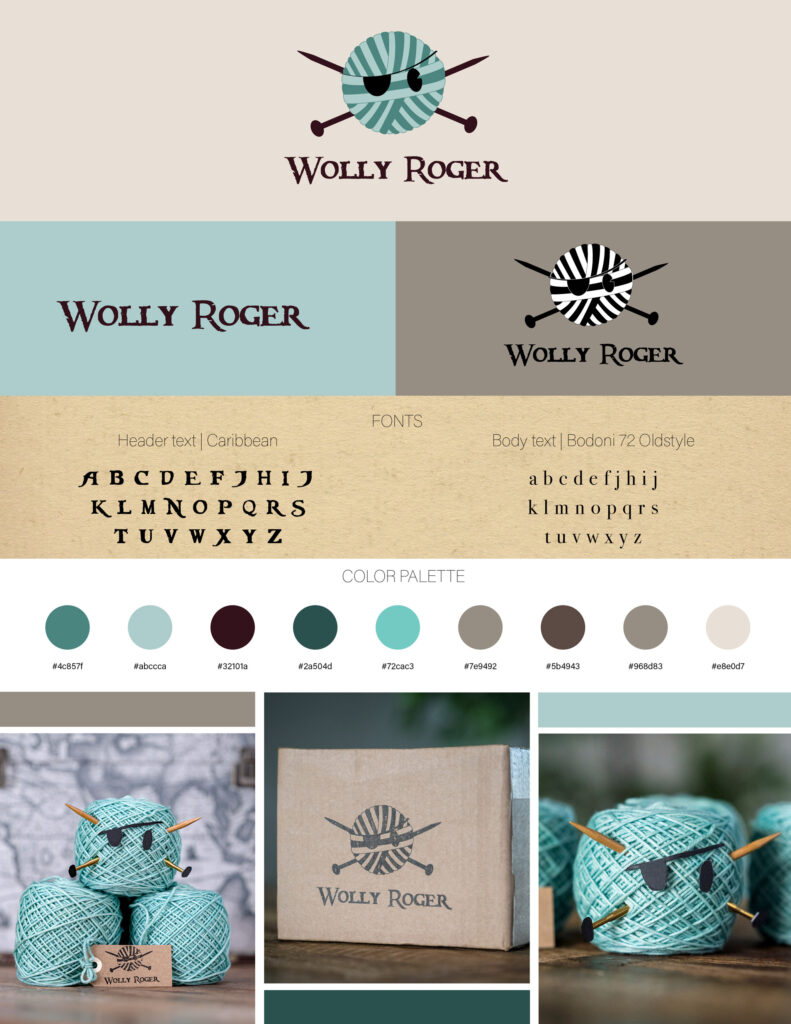
Beyond the photoshoot, I created a visual identity chart for Jessica. This chart is more than a design document. It is a compass for how a brand should look and feel across every channel.
Inside the visual identity chart and mood board
For Wolly Roger, I built a mood board that captured the brand’s essence: playful, cheeky, and rooted in craft. Natural textures like wool fibers and rough paper stock set the base, while cheerful accents brought in warmth and adventure. This board became Jessica’s compass. Each time she created new content, she could return to it and ask: does this feel like Wolly Roger?
Colors that tell a story
The color palette was inspired by the sea and natural materials. Shades of green and aqua brought freshness, balanced by warm kraft browns, soft greys, and parchment tones. A touch of deep plum added contrast. Together these colors carried the pirate spirit while staying modern and playful, and made Wolly Roger instantly recognizable across packaging, photography, and digital channels.
Photography direction that matches the brand voice
The photography style was designed to echo the brand’s bold and witty spirit. Playful product styling, close-up details of fibers, and lifestyle shots of yarn in use gave the visuals energy and personality. This direction gave Jessica freedom to create her own content while keeping a consistent look and it gave me the foundation to later bring the pirate mascot to life.
More than product shots
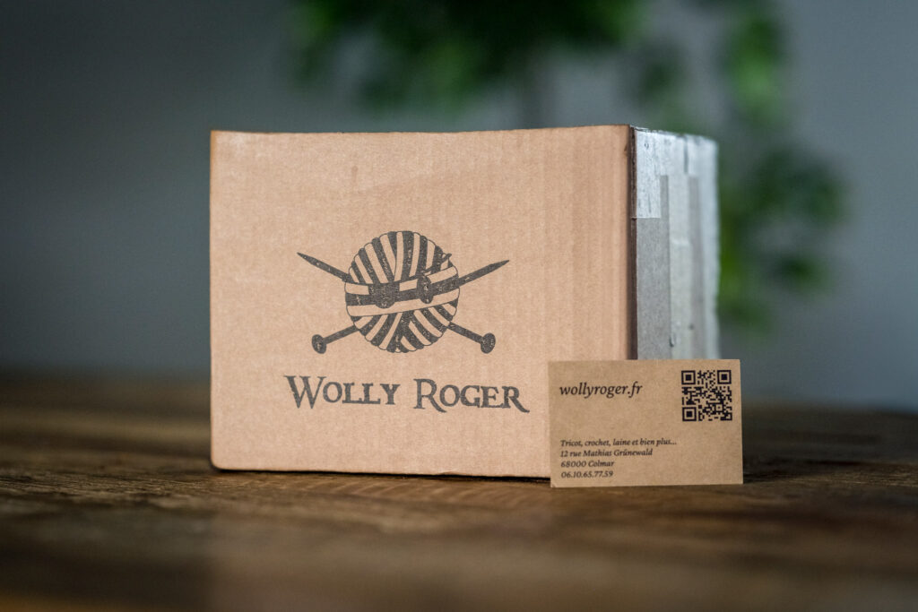
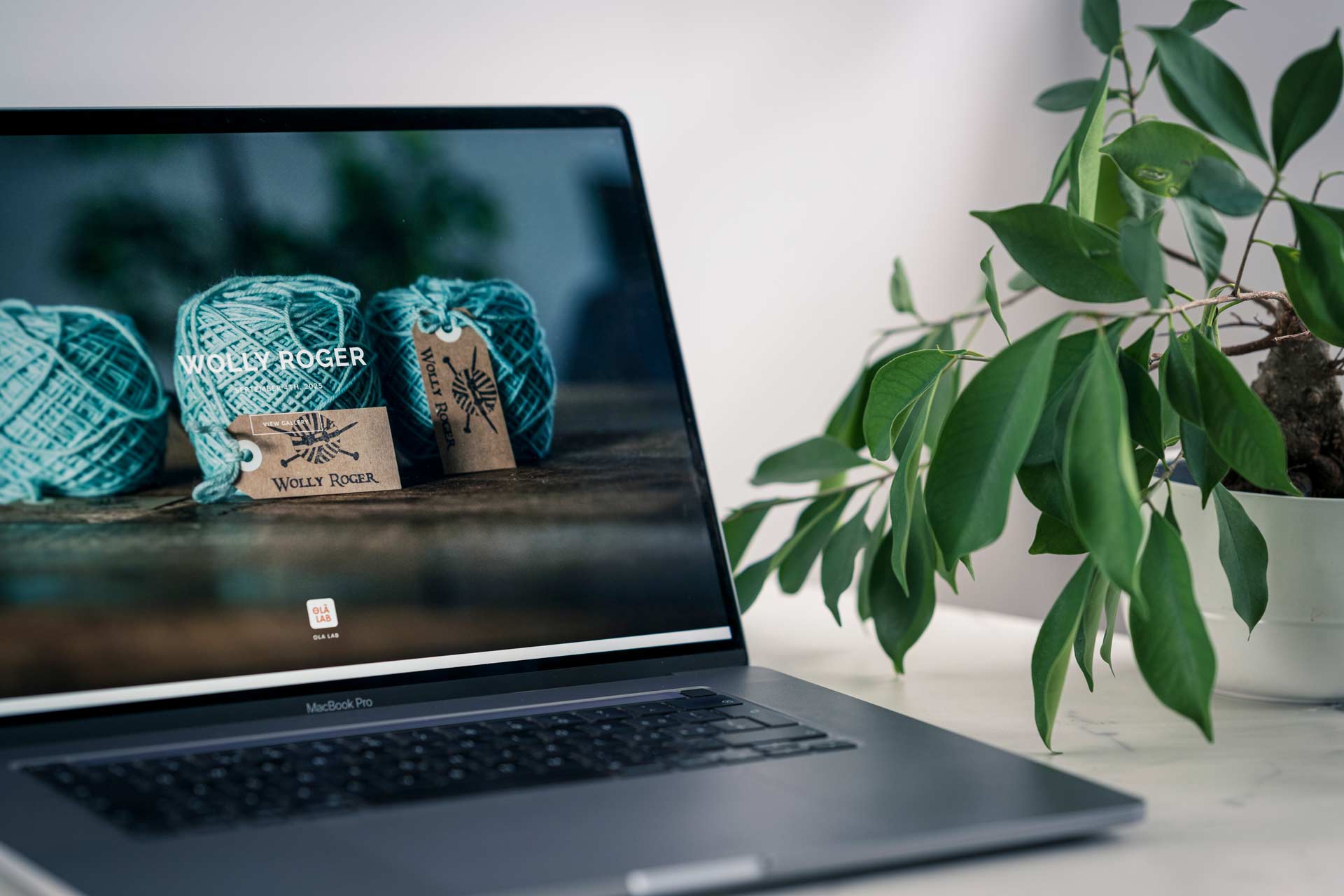
The styled Wolly Roger mascot shoot was not only about making yarn look beautiful. It was created with multiple uses in mind. The images were designed for social media, webshop banners, newsletters, and even transactional emails. They gave Jessica visuals that could work everywhere her brand shows up.
Designing flexible solutions like the blind fond
To give her even more independence, I created a blind fond, a clean background template. With it Jessica can photograph her products in her softbox and later retouch them into the branded setting. This allows her to create new content on her own while keeping the visual identity consistent.
How commercial brand photography helps small businesses grow
Wolly Roger shows what is possible when design and photography come together. Commercial photography is not only about sharp images. It is about giving products a voice, a personality, and a story.
For Jessica, this meant turning a simple ball of yarn into a pirate with a grin. It meant giving her webshop and later her store in Colmar a set of visuals that connect with people, make them smile, and make them remember her brand.
In Amsterdam and across the Netherlands, small businesses are searching for ways to stand out. Professional product photography and visual identity design can help them do just that. And as Wolly Roger proves, this kind of work is not limited to one city or country. It can support brands wherever they grow.
The Ola Lab way of telling stories through visuals
At Ola Lab I believe photography should feel authentic, warm, and true to the brand. Every project begins with listening. What is the story a business wants to tell. What feeling should the customer carry when they see the images.
For Wolly Roger the story was playful, creative, and daring. For another brand it might be elegant, innovative, or rooted in craftsmanship. My role is to translate those qualities into visuals that work across e-commerce, social media, and everyday marketing.
Working with Jessica from the very first logo in 2020 to a physical store in Colmar has been a reminder of why I love this work. Commercial brand photography is not only about showing what a product looks like. It is about showing who a brand is and giving it a life of its own.
And while I am based in Amsterdam, this project in France shows how visual identity and content creation can cross borders. Today it is easier than ever to collaborate with brands across Europe. Whether it is a logo design in Colmar, a photography shoot in Berlin, or content for a webshop in Zurich, the Ola Lab approach adapts to each story. Your location is never a limit to building a strong and consistent brand.

Let’s make your brand unforgettable
If you are building a brand and want to bring your story to life, commercial product photography can give you the tools and the visuals to connect with your audience. Whether you are starting with a webshop, like Jessica did, or dreaming of opening a store of your own, photography and visual identity design will help you tell your story with confidence and consistency.